Preloading Responsive Images: How a Mismatch Causes Double Downloads
A preload with only href, or with an imagesizes value that did not match the image, made Chrome 155 download two files and finish the hero image about a second later on a throttled connection.
Preloading the main image with <link rel="preload" as="image"> is a common speed tip. For responsive images, the preload needs its own copy of the image’s srcset and sizes, written as imagesrcset and imagesizes. If the two do not match, the browser may preload one file and then display another. Does a mismatched preload really cause a second download, and how much does it cost? We tested five versions of the same hero image on a throttled phone and desktop profile.
The test
The page shows one CC0 sunset photo with candidates at 400, 800, 1200 and 1600 pixels (JPEG files of 12.7 to 182.0 KB) and sizes="(max-width: 700px) 100vw, 700px". The five versions were: no preload; a preload with imagesrcset and a matching imagesizes; a preload whose imagesizes was 100vw, a plausible copy-paste mistake; a preload with only href pointing to the 1600-pixel file; and a preload with both href and a matching imagesrcset. Each page was loaded three times in Chrome 155.0.8059.82 on a phone profile (390 pixels, 3× density) and a desktop profile (1440 pixels), throttled to 1.6 Mbit/s with 150 ms latency and a 4× slower CPU, with the cache disabled. Byte figures are transfer sizes. See our methodology.
Results
| Markup | Phone: files | Phone KB | Phone: last image done | Desktop: files | Desktop KB | Desktop: last image done |
|---|---|---|---|---|---|---|
| No preload | 1200.jpg | 105.8 | 907 ms | 800.jpg | 49.2 | 612 ms |
| Preload, imagesrcset + matching imagesizes | 1200.jpg | 105.8 | 915 ms | 800.jpg | 49.2 | 595 ms |
| Preload, imagesizes=100vw (mismatch) | 1200.jpg | 105.8 | 907 ms | 1600.jpg 800.jpg | 231.3 | 1545 ms |
| Preload with href only | 1600.jpg 1200.jpg | 287.9 | 1851 ms | 1600.jpg 800.jpg | 231.3 | 1530 ms |
| Preload with href + imagesrcset | 1200.jpg | 105.8 | 910 ms | 800.jpg | 49.2 | 606 ms |
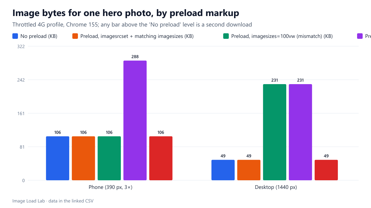
A preload with only href doubled the work on both devices. Chrome downloaded the preloaded 1600-pixel file and then, because the image’s srcset chose a different candidate, downloaded that one too. On the phone that meant 287.9 KB instead of 105.8 KB, and the displayed image finished at 1,851 ms instead of 907 ms: twice as late, because the useless file competed for the same slow connection.
A wrong imagesizes caused the same problem on desktop. With imagesizes="100vw", the desktop preload fetched the 1600-pixel file for a 1440-pixel window, while the image itself, limited to 700 pixels by its real sizes, needed the 800-pixel file. Result: 231.3 KB instead of 49.2 KB and the image done at 1,545 ms instead of 612 ms. On the phone the mismatch was harmless, because 100vw happened to equal the image’s real width there. That is exactly why this mistake is easy to miss when testing on one device.
Matching preloads cost nothing extra. With imagesrcset and a correct imagesizes, with or without an additional href, Chrome made one request for the right file on both devices. Browsers that understand imagesrcset ignore the href, which is only a fallback for those that do not.
On this simple page, the preload did not make the image faster. The matching preload finished at 915 ms on the phone against 907 ms without it. The image tag sat at the top of a tiny page, so Chrome found it immediately anyway. A preload helps when the browser would otherwise discover the image late, for example when it is set in CSS or inserted by a script, as our fetchpriority and preload test discusses.
How to preload a responsive image safely
- Copy
srcsetandsizesexactly intoimagesrcsetandimagesizes. Any difference can mean two downloads. - Never preload a responsive image with
hrefalone. It was the most expensive variant in our test on both devices. - Test on at least two viewport widths. The
100vwmistake only showed up on desktop. - Preload only images the browser cannot find early by itself, such as CSS backgrounds or script-inserted heroes. For a plain
<img>near the top of the HTML, it added nothing here.
Practical conclusion
A responsive image preload is only safe when imagesrcset and imagesizes match the image exactly. A preload with just href, or with a mismatched imagesizes, made Chrome 155 download two files, 2.7 times the bytes on the phone and 4.7 times on the desktop, and finish the visible image about a second later on a throttled connection.
Limitations
One image, one page layout and Chrome only. Applied network throttling does not model connection setup exactly. Other browsers may handle the href fallback differently.
Data and files
Download preload-imagesrcset.csv (10 rows, 0.7 KB) · Method: testing methodology. Photo: image credits.