Lighthouse ‘Explicit Width and Height’: Which Sizing Methods Pass
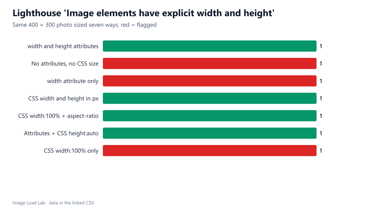
Lighthouse 13.5 accepted width and height attributes, CSS pixel sizes and CSS aspect-ratio, and flagged images with no size, a width attribute alone or a CSS width alone.
Images without known dimensions make the page jump when they load, because the browser cannot reserve their space in advance. Lighthouse’s “Image elements have explicit width and height” audit lists such images. Since modern CSS offers several ways to reserve space, which of them does Lighthouse accept? We sized the same photo seven ways on one page.
The test
The test page shows a 400 × 300 CC0 photo seven times: with width and height attributes; with no size at all; with only a width attribute; with CSS width and height in pixels; with CSS width: 100% and aspect-ratio: 4/3; with attributes plus CSS width: 100%; height: auto; and with only CSS width: 100%. We ran Lighthouse 13.5.0 twice on its mobile profile in Chrome 155.0.8059.82 and read the unsized-images audit. See our methodology.
Results
| How the image is sized | Flagged by Lighthouse |
|---|---|
| width and height attributes | no |
| No attributes, no CSS size | yes |
| width attribute only | yes |
| CSS width and height in px | no |
| CSS width:100% + aspect-ratio | no |
| Attributes + CSS height:auto | no |
| CSS width:100% only | yes |
Three ways failed, four passed. Lighthouse flagged the image with no size, the one with only a width attribute and the one with only a CSS width. It accepted width and height attributes, CSS width and height in pixels, CSS aspect-ratio, and the common combination of attributes with height: auto. Both runs agreed.
A single dimension is not enough. With only a width, the browser knows how wide the image will be but not how tall until the file arrives; the audit treats it like an unsized image.
CSS aspect-ratio counts. Reserving space with aspect-ratio instead of attributes passed, which matters for layouts that set image shapes in CSS.
Why it matters
In our layout shift test, images without dimensions produced a Cumulative Layout Shift of 0.1495 on a phone, above the 0.1 limit for a “good” score, while width and height attributes or CSS aspect-ratio brought it to zero. The audit is a direct check for that cause.
The simplest pattern
- Always write
widthandheightattributes with the file’s real pixel size, and addheight: autoto the CSS so the image can still scale. WordPress and most frameworks do this automatically. - Use
aspect-ratiowhen the image’s shape is set by design rather than by the file, for example in a card grid, together withobject-fit: cover. - Check images added by scripts, sliders and embeds; they are the usual source of unsized images on otherwise clean sites.
The four passing patterns in code
<!-- 1. attributes (the usual choice) -->
<img src="photo.jpg" width="400" height="300" alt="…">
<!-- 2. attributes, scaled by CSS -->
<img src="photo.jpg" width="400" height="300" style="width:100%;height:auto" alt="…">
<!-- 3. fixed CSS size -->
<img src="photo.jpg" style="width:400px;height:300px" alt="…">
<!-- 4. CSS aspect ratio -->
<img src="photo.jpg" style="width:100%;aspect-ratio:4/3" alt="…">
In WordPress, images inserted through the editor already get width and height attributes, and WordPress adds missing ones to images in post content when it knows the file. The images that fail the audit on WordPress sites usually come from page builders, sliders, ad slots and HTML pasted into widgets.
Practical conclusion
Lighthouse 13.5 accepted width and height attributes, CSS pixel sizes and CSS aspect-ratio, and flagged images with no size, a width attribute alone or a CSS width alone. Give every image both dimensions, or an aspect ratio, and let CSS scale it with height: auto.
Limitations
One page and one image size. Lighthouse’s documentation describes exemptions for some elements, such as images positioned outside the normal flow; we did not test those cases.
Data and files
Download lh-unsized-images.csv (7 rows, 0.4 KB) · Method: testing methodology. Photo: image credits.