object-fit: cover and srcset: Blurry Images and Hidden Bytes
Setting sizes to the box width made object-fit: cover enlarge a file a third too narrow. Files cropped to the box were sharp and 35 to 54 % smaller than the best srcset choice.
Card layouts often show photos in square or wide boxes with object-fit: cover. The CSS scales the image until it fills the box and crops whatever sticks out. That creates two problems that are easy to miss. The browser chooses the srcset file from the box width, but cover may draw the image wider than the box, so the chosen file gets enlarged. And the cropped-away pixels are downloaded anyway. How much sharpness and how many bytes does that cost, and what is the cleanest fix? We measured both with a 4:3 photo in a square box and a wide box.
The test
We used a 4:3 CC0 photo of a market entrance with a large red sign, encoded with MozJPEG at quality 80 at six widths from 300 to 1600 pixels. Each test page showed it in one box with object-fit: cover, in Chrome 155.0.8059.82 at 1× and 2× pixel density:
- a 300 × 300 box with
sizes="300px", the box width; - the same box with
sizes="400px", the widthcoveractually draws a 4:3 image in a 300-pixel-tall box; - the same box with a single 1600-pixel file and no
srcset; - a 600 × 200 box with
sizes="600px".
We recorded which file Chrome chose and compared it with the width needed for a sharp result. We also encoded files cropped in advance to each box’s proportions (300 × 300, 600 × 600, 600 × 200 and 1200 × 400) with the same settings. Finally, we took screenshots of the square box at 2× to compare sharpness. See our methodology.
Results
| Box | Screen | Markup | File delivered | Width needed for cover | Sharp? | File size |
|---|---|---|---|---|---|---|
| 300 × 300 box | 1× | sizes=”300px” | 300 × 225 | 400 px | No, enlarged | 12.2 KB |
| 300 × 300 box | 2× | sizes=”300px” | 600 × 450 | 800 px | No, enlarged | 35.5 KB |
| 300 × 300 box | 1× | sizes=”400px” (corrected) | 450 × 338 | 400 px | Yes | 22.9 KB |
| 300 × 300 box | 2× | sizes=”400px” (corrected) | 900 × 675 | 800 px | Yes | 64.4 KB |
| 300 × 300 box | 1× | one 1600 px file | 1600 × 1200 | 400 px | Yes | 138.8 KB |
| 300 × 300 box | 2× | one 1600 px file | 1600 × 1200 | 800 px | Yes | 138.8 KB |
| 600 × 200 box | 1× | sizes=”600px” | 600 × 450 | 600 px | Yes | 35.5 KB |
| 600 × 200 box | 2× | sizes=”600px” | 1200 × 900 | 1200 px | Yes | 95.6 KB |
| 300 × 300 box | 1× | pre-cropped file | 300 × 300 | – | Yes | 14.6 KB |
| 300 × 300 box | 2× | pre-cropped file | 600 × 600 | – | Yes | 41.7 KB |
| 600 × 200 box | 1× | pre-cropped file | 600 × 200 | – | Yes | 16.8 KB |
| 600 × 200 box | 2× | pre-cropped file | 1200 × 400 | – | Yes | 44.0 KB |
The box width gave a blurry image. With sizes="300px", Chrome picked the 300-pixel file at 1× and the 600-pixel file at 2×, exactly as instructed. But cover draws a 4:3 photo 400 pixels wide to fill a 300-pixel-tall box, so both files were enlarged by a third.
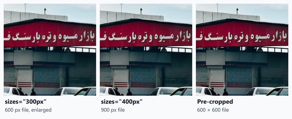
The difference is small but visible on the lettering of the sign. The version with sizes="400px" and the pre-cropped file look the same.
Correcting sizes fixed sharpness, at a price. With sizes="400px", Chrome picked the 450-pixel file (22.9 KB) at 1× and the 900-pixel file (64.4 KB) at 2×. Both were sharp, but a quarter of every file’s pixels is cropped away and never seen.
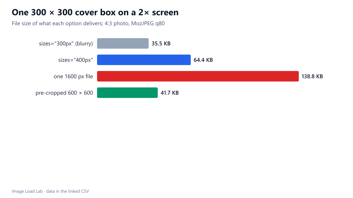
Pre-cropped files were sharp and the smallest. A 600 × 600 file for the square box on a 2× screen weighed 41.7 KB, 35 % less than the corrected srcset choice (64.4 KB), and 70 % less than one 1600-pixel file (138.8 KB). At 1×, 14.6 KB against 22.9 KB.
The wide box wasted even more. For the 600 × 200 box, cover draws the image at the box width, so srcset chose correctly and the result was sharp. But only 44 % of the drawn pixels are visible. A pre-cropped 600 × 200 file was 16.8 KB instead of 35.5 KB at 1×, and 1200 × 400 was 44.0 KB instead of 95.6 KB at 2×, about 53–54 % less.
What to do
- Best: crop the files to the box’s proportions. Then
object-fithas nothing to crop,sizesis simply the box width, and no hidden pixels are downloaded. In WordPress, register a cropped size withadd_image_size( 'card', 600, 600, true ). WordPress builds a separatesrcsetfrom the sizes that share those proportions. - If you cannot crop: write
sizesfor the drawn width, not the box width. Forcover, that is the larger of the box width and the box height multiplied by the image’s width-to-height ratio. For a 4:3 image in a square box, that is 4/3 of the box width. - Watch the focal point. Pre-cropping fixes the crop position. With
object-fityou can move it withobject-positionper breakpoint. If the crop must change with the layout, the<picture>approach in our art direction guide serves differently cropped files. - Never send one large file into small cover boxes. The single 1600-pixel file was sharp, but it weighed from twice to more than nine times as much as the alternatives.
Practical conclusion
With object-fit: cover, setting sizes to the box width made Chrome download files a third too narrow, and the photo came out slightly soft. Writing sizes for the drawn width fixed sharpness but still downloaded cropped-away pixels. Files cropped to the box’s proportions were sharp and 35–54 % smaller than the best srcset choice of the uncropped photo.
Limitations
One photo, two box shapes and one JPEG quality, in Chrome only. The savings from pre-cropping depend on how much of the image the box hides: a box close to the photo’s own proportions saves little. Sharpness was judged from screenshots, not scored with a metric.
Data and files
Download object-fit-cover.csv (8 rows, 1.0 KB) · Download object-fit-precropped.csv (4 rows, 0.1 KB) · Method: testing methodology. Photo: image credits.