sizes for Grid Layouts: What 100vw Costs in a Card Grid
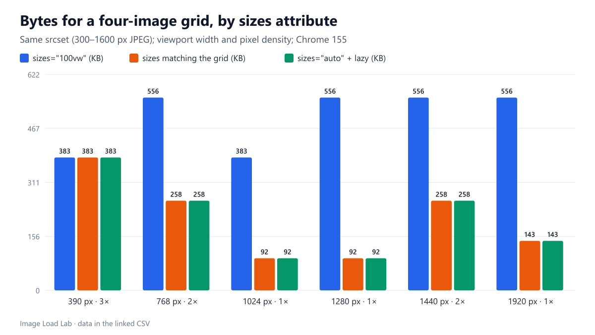
In a one- to four-column grid, sizes=100vw made Chrome download up to 556 KB for four cards where 92 KB was enough. A matching sizes list or sizes=auto picked the right files.
The sizes attribute tells the browser how wide an image will be on the page before the CSS has been applied. Many themes and tutorials copy sizes="100vw", “as wide as the screen”, onto every image. In a grid of cards, that is wrong at every width except the one-column phone layout. How many extra bytes does 100vw cost in a typical grid, and does sizes="auto" solve it? We loaded the same four-card grid with three sizes values on six screens.
The test
The grid uses CSS Grid with 16-pixel gaps and padding: one column below 600 pixels of viewport width, two up to 999, three up to 1399 and four above that. Each of the four cards holds the same 4:3 CC0 market photo with a srcset of six MozJPEG files: 300, 450, 600, 900, 1200 and 1600 pixels wide, at quality 80. We tested three versions:
sizes="100vw", the common copy-paste value;- a
sizeslist that matches the grid:(max-width: 599px) calc(100vw - 32px), (max-width: 999px) calc(50vw - 24px), (max-width: 1399px) calc(33.3vw - 22px), calc(25vw - 20px); sizes="auto"withloading="lazy", which lets the browser use the laid-out width.
We loaded each version in Chrome 155.0.8059.82 at six combinations of viewport width and pixel density, from a 390-pixel phone at 3× to a 1920-pixel desktop at 1×. For each, we recorded the file chosen and the bytes transferred for all four images. See our methodology.
Results
| sizes | Viewport | Columns | Slot width | Pixels needed | File chosen | Four images |
|---|---|---|---|---|---|---|
| sizes="100vw" | 390 px, 3× | 1 | 358 px | 1074 px | 1200 px | 383 KB |
| sizes="100vw" | 768 px, 2× | 2 | 360 px | 720 px | 1600 px | 556 KB |
| sizes="100vw" | 1024 px, 1× | 3 | 320 px | 320 px | 1200 px | 383 KB |
| sizes="100vw" | 1280 px, 1× | 3 | 405 px | 405 px | 1600 px | 556 KB |
| sizes="100vw" | 1440 px, 2× | 4 | 340 px | 680 px | 1600 px | 556 KB |
| sizes="100vw" | 1920 px, 1× | 4 | 460 px | 460 px | 1600 px | 556 KB |
| sizes matching the grid | 390 px, 3× | 1 | 358 px | 1074 px | 1200 px | 383 KB |
| sizes matching the grid | 768 px, 2× | 2 | 360 px | 720 px | 900 px | 258 KB |
| sizes matching the grid | 1024 px, 1× | 3 | 320 px | 320 px | 450 px | 92 KB |
| sizes matching the grid | 1280 px, 1× | 3 | 405 px | 405 px | 450 px | 92 KB |
| sizes matching the grid | 1440 px, 2× | 4 | 340 px | 680 px | 900 px | 258 KB |
| sizes matching the grid | 1920 px, 1× | 4 | 460 px | 460 px | 600 px | 143 KB |
| sizes="auto" + lazy | 390 px, 3× | 1 | 358 px | 1074 px | 1200 px | 383 KB |
| sizes="auto" + lazy | 768 px, 2× | 2 | 360 px | 720 px | 900 px | 258 KB |
| sizes="auto" + lazy | 1024 px, 1× | 3 | 320 px | 320 px | 450 px | 92 KB |
| sizes="auto" + lazy | 1280 px, 1× | 3 | 405 px | 405 px | 450 px | 92 KB |
| sizes="auto" + lazy | 1440 px, 2× | 4 | 340 px | 680 px | 900 px | 258 KB |
| sizes="auto" + lazy | 1920 px, 1× | 4 | 460 px | 460 px | 600 px | 143 KB |
On the one-column phone layout, all three versions were the same. The card is almost as wide as the screen there, so 100vw is nearly right. The 3× phone needed 1,074 pixels and got the 1200-pixel file in every version.
Everywhere else, 100vw downloaded the largest or second-largest file. On a 1280-pixel laptop at 1×, the three-column cards are 405 pixels wide. With 100vw Chrome fetched the 1600-pixel file for each card: 556 KB for four images. With the matching list it fetched the 450-pixel file: 92 KB, 83 % less. On a 1920-pixel desktop the grid needed 460-pixel images and got 600-pixel files (143 KB) instead of 1600-pixel ones (556 KB). On 2× screens the matching list chose 900-pixel files (258 KB) where 100vw again took 1600 pixels.
sizes="auto" made exactly the same choices as the hand-written list in all six cases. For a lazy-loaded image, the browser waits until layout before fetching, so it knows the real slot width and does not need a guess.
What this means
100vwis only right for full-width images. In our grid it made Chrome download four to six times the bytes needed on 1× desktop screens, and about twice as much on 2× screens.- Write
sizesfrom your CSS breakpoints. For each column count, the slot is the viewport width divided by the columns, minus the gaps and padding. Small errors do not matter much, because the browser rounds up to the next candidate anyway. - Use
sizes="auto"for lazy-loaded images. WordPress already writessizes="auto, …"for lazy images; we saw it in this site’s own HTML. Keep a fallback list afterautofor browsers that do not support it. - Do not use
autoon images in the first screen. It only works together withloading="lazy", and the first visible images should not be lazy-loaded, as our lazy-loading test explains. Give them an explicit list. - Have enough candidates. Correct
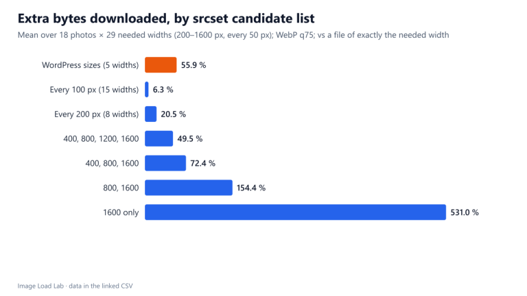
sizesonly helps if a file close to the needed width exists. Our srcset widths test measures the cost of gaps.
Example for a responsive card grid
<img src="card-600.jpg"
     srcset="card-300.jpg 300w, card-450.jpg 450w, card-600.jpg 600w,
             card-900.jpg 900w, card-1200.jpg 1200w"
     sizes="auto, (max-width: 599px) calc(100vw - 32px),
            (max-width: 999px) calc(50vw - 24px),
            (max-width: 1399px) calc(33.3vw - 22px), calc(25vw - 20px)"
     loading="lazy" width="1200" height="900" alt="…">
To check what a page really downloads, use the method in our DevTools image audit guide, or compare the rendered width with the file width in the Elements panel.
Practical conclusion
In a one- to four-column grid, sizes="100vw" made Chrome download up to 556 KB for four cards where 92 to 258 KB was enough. That is up to 83 % waste on every screen except the one-column phone layout. A sizes list that follows the grid’s breakpoints, or sizes="auto" on lazy-loaded images, picked the right files in all six cases we tested.
Limitations
One grid, one photo and six screen combinations in Chrome only. Firefox and Safari choose candidates with their own rules, and some browsers pick smaller files on slow connections. The largest candidate was 1600 pixels, which capped the 100vw results on 2× screens: with larger candidates in the list, 100vw would have cost even more there.
Data and files
Download grid-sizes.csv (18 rows, 1.1 KB) · Method: testing methodology. Photo: image credits.