Lighthouse ‘Serves Images With Appropriate Resolution’: Where the Line Is
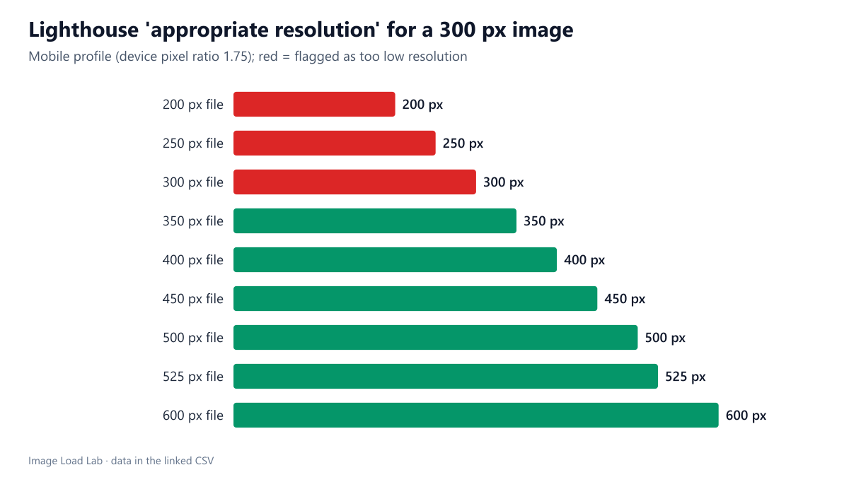
In a 300-pixel slot on Lighthouse's 1.75× mobile profile, files of 300 pixels or less were flagged as too low resolution and files from 350 pixels passed, against a stated expected size of 450.
Most image advice is about files that are too big. Lighthouse also checks the opposite: in its Best Practices category, “Serves images with appropriate resolution” flags images that are too small for the space they fill, which look soft on high-density screens. How small can an image be before Lighthouse complains, and what does it consider the right size? We showed the same photo at nine file widths in a fixed slot.
The test
Each test page displays a CC0 market photo in a slot of exactly 300 × 225 CSS pixels. The file behind it was 200, 250, 300, 350, 400, 450, 500, 525 or 600 pixels wide (MozJPEG quality 85). We ran Lighthouse 13.5.0 once per page with its default mobile profile, which emulates a 412-pixel-wide screen at a device pixel ratio of 1.75, in Chrome 155.0.8059.82, and read the image-size-responsive audit with its reported displayed, actual and expected sizes. See our methodology.
Results
| File width | Displayed at | Flagged | Lighthouse ‘expected size’ |
|---|---|---|---|
| 200 px | 300 × 225 | yes | 450 x 338 |
| 250 px | 300 × 225 | yes | 450 x 338 |
| 300 px | 300 × 225 | yes | 450 x 338 |
| 350 px | 300 × 225 | no | – |
| 400 px | 300 × 225 | no | – |
| 450 px | 300 × 225 | no | – |
| 500 px | 300 × 225 | no | – |
| 525 px | 300 × 225 | no | – |
| 600 px | 300 × 225 | no | – |
Files up to 300 pixels wide were flagged; files from 350 pixels passed. For a 300-pixel slot on a 1.75× screen, a 300-pixel file is shown at its own size but each image pixel covers almost two screen pixels; Lighthouse flagged it, along with the 250- and 200-pixel files. The 350-pixel file, still smaller than the 525 device pixels of the slot, passed.
Lighthouse reported an “expected size” of 450 × 338. That is 1.5 times the CSS size, less than the 1.75 device pixel ratio of the emulated screen. Combined with the pass at 350 pixels, it shows that the audit applies a tolerance: it does not demand a file that fills every device pixel, only one that is not far below it.
What this means in practice
- Passing the audit does not mean the image is sharp. A 350-pixel file in a 300-pixel slot passed, but on a 2× or 3× phone it is enlarged 1.7 to 2.6 times. Our high-DPI test measured how much quality that costs: in an 800-pixel slot at 2×, a 1.5× file scored 28.8 against 70.1 for a 2× file.
- Failing it is easy with fixed-size images. Logos, avatars and thumbnails exported at exactly their CSS size will be flagged on Lighthouse’s mobile profile. Export them at 2× (with
srcsetdescriptors, as in our x and w descriptor test). - The cure is not one huge file. Lighthouse’s “Improve image delivery” insight flags images that are too large; our oversized image test found it flagging a file 27 % wider than the slot needed. Responsive images satisfy both checks.
How to find and fix flagged images
In a Lighthouse report the audit sits under Best Practices; each flagged image lists its displayed, actual and expected sizes. In DevTools you can confirm the problem by selecting the image in the Elements panel: the tooltip shows its rendered size and its intrinsic size. The usual fix for a fixed-size image is to offer a double-resolution file:
<img src="logo-300.png"
     srcset="logo-300.png 1x, logo-600.png 2x"
     width="300" height="100" alt="Company name">
Browsers on standard screens keep the small file; high-density screens take the larger one. For images whose width changes with the layout, use width descriptors and sizes instead, so that the browser picks the right file for every screen.
Practical conclusion
Lighthouse 13.5 flagged a 300-pixel slot filled by files of 300 pixels or less and accepted files from 350 pixels, reporting 450 pixels as the expected size on its 1.75× mobile profile. Treat the audit as a minimum: for genuinely sharp images on modern phones, provide about two to three times the CSS width through srcset.
Limitations
One slot size, one run per file and Lighthouse’s mobile profile only; the desktop profile (1× density) would accept smaller files. The exact tolerance lies between 300 and 350 pixels for this slot; we did not test widths in between.
Data and files
Download lh-image-size-responsive.csv (9 rows, 0.3 KB) · Method: testing methodology. Photo: image credits.