srcset x vs w Descriptors: Which File Chrome Downloads at Each Pixel Ratio
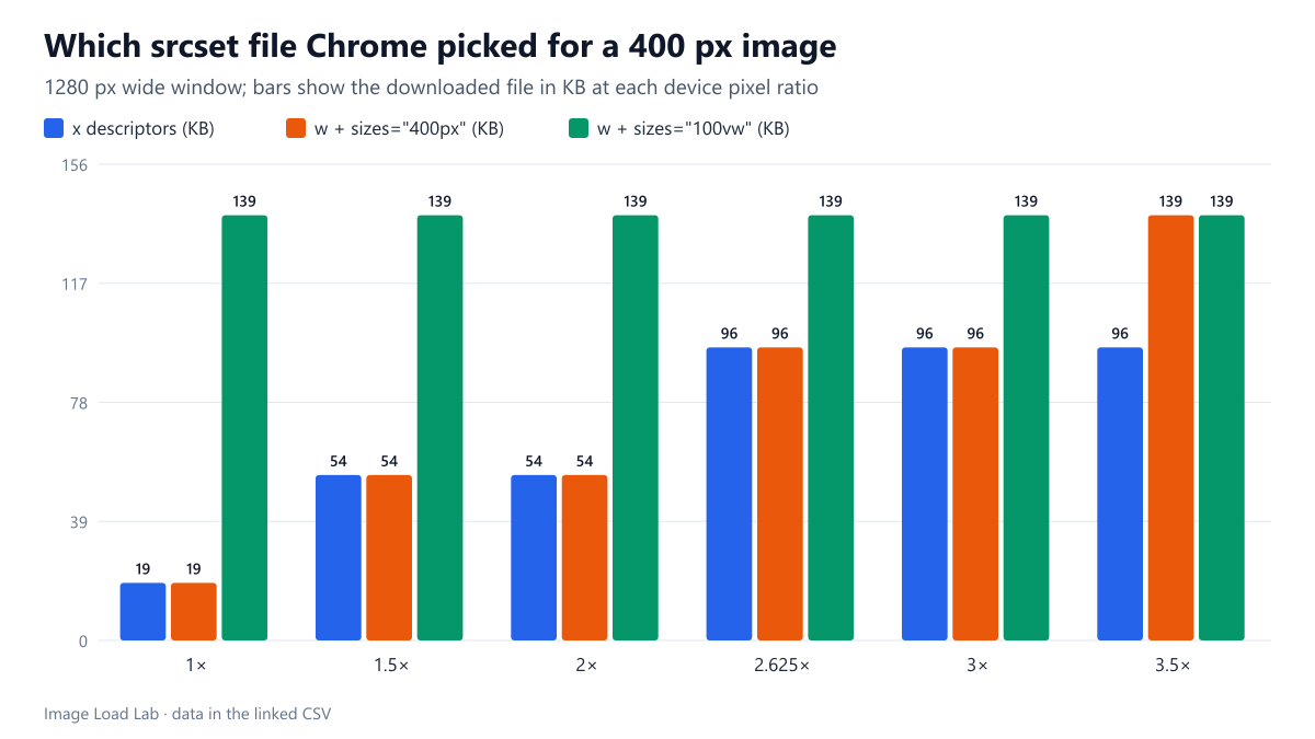
For a 400-pixel image, x descriptors and w descriptors with sizes=400px chose the same files up to 3×. A sizes value of 100vw made a 1280-pixel window download a file 7.4 times larger.
srcset has two ways of describing candidates. Density descriptors (1x, 2x, 3x) suit images that are always shown at the same size. Width descriptors (400w, 800w…) plus sizes suit images whose size changes with the layout. For a fixed-size image, do both give the same result, and what does Chrome do on screens with fractional pixel ratios such as 1.5 or 2.625? We loaded three versions of the same markup at six pixel densities.
The test
The image is a 400 CSS-pixel CC0 photo of a market, offered at 400, 800, 1200 and 1600 pixels wide (JPEG quality 80; 18.8, 54.1, 95.8 and 138.9 KB transferred, including HTTP headers). The three markups were: x descriptors (400 px as 1x, 800 px as 2x, 1200 px as 3x); w descriptors for all four files with sizes="400px"; and the same w descriptors with sizes="100vw", a common copy-paste default. Each page was loaded in Chrome 155.0.8059.82 at device pixel ratios of 1, 1.5, 2, 2.625, 3 and 3.5, in a 390-pixel and a 1280-pixel wide window, with the cache disabled. We recorded the downloaded file from the network log. See our methodology.
Results
| Device pixel ratio | Pixels the slot needs | x descriptors | w + sizes=400px | w + sizes=100vw (1280 px window) |
|---|---|---|---|---|
| 1× | 400 px | 400 px | 400 px | 1600 px |
| 1.5× | 600 px | 800 px | 800 px | 1600 px |
| 2× | 800 px | 800 px | 800 px | 1600 px |
| 2.625× | 1050 px | 1200 px | 1200 px | 1600 px |
| 3× | 1200 px | 1200 px | 1200 px | 1600 px |
| 3.5× | 1400 px | 1200 px | 1600 px | 1600 px |
For a fixed slot, x descriptors and w with the correct sizes picked the same file at every ratio from 1 to 3. Chrome multiplies the slot width by the pixel ratio and takes the smallest candidate that covers it: at 1.5× the slot needs 600 pixels, so both markups downloaded the 800-pixel file; at 2.625× it needs 1,050 pixels and both took the 1200-pixel file. The window width (390 or 1280 pixels) made no difference for these two markups.
At 3.5×, x descriptors stopped at their largest entry. The density markup only lists up to 3x, so Chrome used the 1200-pixel file. With width descriptors it could see that a 1600-pixel file existed and took it, since 400 × 3.5 = 1,400 pixels.
sizes="100vw" on a 400-pixel image was expensive on a wide window. At 1280 pixels, Chrome assumed the image would fill the window and downloaded the 1600-pixel file at every pixel ratio: 138.9 KB at 1× instead of 18.8 KB, 7.4 times more for an identical result on screen. In the 390-pixel window the same markup was harmless, because 100vw happened to be close to the real slot.
Which descriptor to use
- Fixed-size images (logos, avatars, thumbnails in a fixed grid):
xdescriptors are shorter and gave the same result up to 3×. Add a 4x entry only if you care about the few screens above 3×. - Images that change size with the layout (article images, heroes, product photos): use
wdescriptors and asizesvalue that describes the real slot. Our srcset and sizes test and the WordPress size audit show how much a wrong value costs on real pages. - Never leave
sizes="100vw"on an image that is narrower than the window. It was the most expensive mistake in this test. - Fractional pixel ratios round up to the next candidate. If 1.5× or 2.625× screens matter to your audience, a candidate close to 600 or 1,050 pixels avoids sending a file that is up to a third larger than needed.
Practical conclusion
For an image with a fixed CSS width, x descriptors and w descriptors with an accurate sizes value downloaded identical files in Chrome 155 at every pixel ratio up to 3. The real risk is an inaccurate sizes: 100vw made a 1280-pixel window download a file 7.4 times larger than needed.
Limitations
Chrome only, with pixel ratios set by Chrome’s device emulation rather than on physical phones. One image, four candidates. Browsers are allowed to choose differently, for example to save data on slow connections; we tested on a fast local connection.
Data and files
Download srcset-descriptors.csv (36 rows, 2.1 KB) · Method: testing methodology. Photo: image credits.