A srcset list describes available files; the sizes attribute describes how wide the image is expected to render before layout completes. If sizes does not match the CSS, the browser can choose a candidate larger or smaller than the page needs. The markup should begin with the layout, not a random list of breakpoints.
Give the browser enough accurate information to choose a suitable candidate for each viewport and pixel density.
Repeatable method
1. Measure the rendered slot
Inspect the component at representative viewport widths. Record the CSS pixel width of the image slot, including max-width rules and multi-column transitions.
2. Choose candidate widths
Create a small ladder that covers the observed slot widths multiplied by common device pixel ratios. Avoid many candidates with negligible differences.
3. Write sizes in breakpoint order
Start with the first matching media condition and finish with the default slot width. Keep a real src fallback.
<img
  src="report-1200.webp"
  srcset="report-480.webp 480w, report-768.webp 768w, report-1200.webp 1200w"
  sizes="(max-width: 768px) 100vw, 760px"
  width="1200" height="800"
  alt="Performance report chart">
4. Verify currentSrc
Resize the viewport, reload with cache disabled, and inspect the img currentSrc property or Network response. The chosen candidate can remain cached, so use a fresh context for clean comparisons.
A measured responsive candidate set
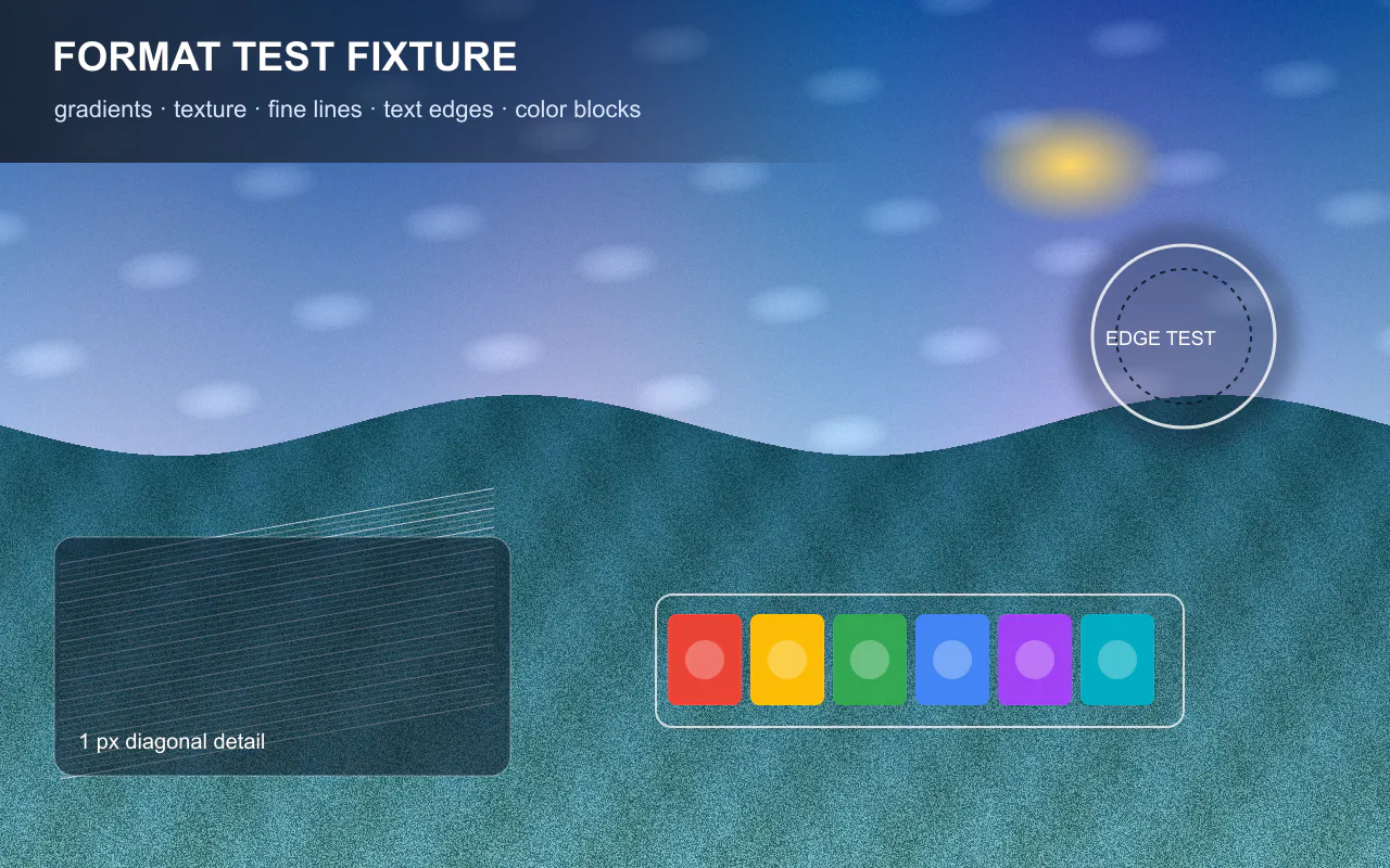
On August 12, 2026, we resized the same original 1280 × 800 RGB fixture to 480, 768,
1024, and 1280 pixels wide. Every candidate used libvips Lanczos3 resizing and the same
WebP settings: quality 80, effort 6, and smart subsampling. The bytes below come from the
generated files; they are not estimates based on pixel area.
currentSrc, rendered slot, viewport, and device-pixel ratio together ratherthan assuming which resource the browser chose.
| Candidate | Dimensions | Measured file size | SHA-256 prefix |
|---|---|---|---|
| 480w | 480 × 300 | 17,014 bytes (16.6 KiB) | 3096212e3de9 |
| 768w | 768 × 480 | 49,160 bytes (48.0 KiB) | b51fa1c87922 |
| 1024w | 1024 × 640 | 97,684 bytes (95.4 KiB) | f26804d89b79 |
| 1280w | 1280 × 800 | 184,940 bytes (180.6 KiB) | b7a7b1b2ecf0 |
<img
  src="ill-responsive-fixture-1280.webp"
  srcset="ill-responsive-fixture-480.webp 480w,
          ill-responsive-fixture-768.webp 768w,
          ill-responsive-fixture-1024.webp 1024w,
          ill-responsive-fixture-1280.webp 1280w"
  sizes="(max-width: 768px) calc(100vw - 32px), 760px"
  width="1280"
  height="800"
  alt="Synthetic image fixture with gradients, texture, fine lines, text edges, and color blocks">
Turn slot width into a testable expectation
| Viewport | CSS slot | DPR | Physical demand | Candidate expectation |
|---|---|---|---|---|
| 390 px | 358 px | 2× | 716 px | 768w is the first candidate at or above demand |
| 768 px | 736 px | 1.5× | 1104 px | 1280w is the first candidate at or above demand |
| 1440 px | 760 px | 2× | 1520 px | 1280w is the declared source-width cap |
These expectations are arithmetic, not observations. The browser can consider DPR, zoom, cache,
data-saving behavior, available candidates, and implementation details. The downloadable verification
page reports viewport width, DPR, rendered slot, physical demand, currentSrc, and
naturalWidth in one record. Use that value as the observed selection.
The final row deliberately documents a limit instead of upscaling. The source is 1280 pixels wide, so
creating a 1520w or 1600w file would add pixels without adding source detail. A production workflow can
use a larger master when a 760 CSS-pixel slot must remain sharp at 2× DPR.
Environment and reproducibility record
- Run date:
- Node.js v24.14.0; Sharp 0.34.5; libvips 8.17.3; WebP 1.6.0
- Resize: Lanczos3; enlargement disabled; aspect ratio retained
- Encode: WebP quality 80; effort 6; smart subsampling enabled
- Source SHA-256:
8ee761ff7a23c8ecccec1c2acf8db61dc975fca184e769169e01af4f35394da6 - Full hashes and unrounded byte counts are in the CSV and JSON records.
Download the source, candidates, data, and demo (ZIP) ·
Download measured sizes and hashes (CSV) ·
Limitations: file size depends on image content and encoder build. Candidate expectation
is not proof of browser selection. This run does not test network timing, decode cost, alternate formats,
client hints, CDN transformations, every DPR, browser zoom level, or data-saving mode.
What to record
Record viewport width, device pixel ratio, rendered slot width, sizes rule, candidate list, selected currentSrc, transferred bytes, and cache state. Note whether the browser reused a previously downloaded larger file.
A result belongs to the source file, encoder, settings, browser, viewport, cache state, and date that produced it. Repeat the test on representative files before changing a production workflow.
Common mistakes
- Using viewport breakpoints that do not match the component
- Omitting sizes with width-descriptor candidates
- Testing after a larger candidate is already cached
- Creating nearly identical candidates that add maintenance without meaningful savings
Verification checklist
Check small mobile, wide mobile, tablet, and desktop layouts. Confirm no candidate is visibly soft, no candidate is dramatically oversized for its slot, width and height prevent layout shifts, and the fallback src works.
Primary references
Related lab notes
About this guide
We distinguish documented platform behavior from our workflow recommendations. See the testing methodology, editorial policy, and corrections log.