Does Chrome Reuse a Larger srcset Image From Its Cache?
Chrome 155 never downgraded an image on the same page, but a new visit on a narrow screen downloaded the small file although the large one was cached. A reload fetched the small file and still showed the large one.
Responsive images send small screens a small file and large screens a large one. Real visitors do not keep one screen size forever: they rotate phones, resize windows and come back later on another device. When Chrome already has a larger srcset candidate, does it reuse it, and does it ever download a second file for the same image? We ran five scenarios with the HTTP cache switched on.
The test
The page shows one CC0 photo of a carved street sign with four candidates (400, 800, 1200 and 1600 pixels wide; 22.8 KB to 495.4 KB) and sizes="100vw", so the chosen file depends only on the window width. The server sent Cache-Control: public, max-age=31536000, immutable, so every downloaded file stayed in the browser’s cache. Each scenario used a fresh browser profile in Chrome 155.0.8059.82 and was repeated three times:
- A: load at 1600 pixels, shrink the window to 400, widen it again to 1600.
- B: load at 400 pixels, then widen to 1600.
- C: visit at 1600 pixels, close the tab, then open the page in a new 400-pixel tab.
- D: the reverse of C: first 400 pixels, then a new 1600-pixel tab.
- E: load at 1600 pixels, shrink to 400 and reload the page.
We logged every image request, its transfer size from Resource Timing, and the file actually displayed (currentSrc). All three runs of every scenario gave identical results. The bench is described on the methodology page.
Results
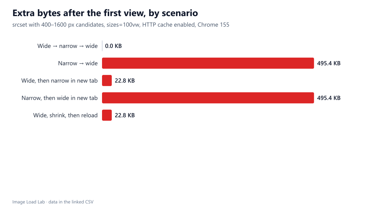
| Scenario | Requests in order (step: file) | File displayed at the end | Network bytes after first view |
|---|---|---|---|
| Wide → narrow → wide | load at 1600 px: 1600 px | 1600 px | 0.0 KB |
| Narrow → wide | load at 400 px: 400 px → widen to 1600 px: 1600 px | 1600 px | 495.4 KB |
| Wide, then narrow in new tab | first visit at 1600 px: 1600 px → second visit at 400 px (new tab): 400 px | 400 px | 22.8 KB |
| Narrow, then wide in new tab | first visit at 400 px: 400 px → second visit at 1600 px (new tab): 1600 px | 1600 px | 495.4 KB |
| Wide, shrink, then reload | load at 1600 px: 1600 px → reload at 400 px: 1600 px (from cache, 0 bytes) → reload at 400 px: 400 px | 1600 px | 22.8 KB |
Within one page, Chrome never downgrades. In scenario A the 1600-pixel file stayed on screen after the window shrank to 400 pixels, and no smaller file was requested. Widening again cost nothing either. That is the efficient choice: the larger file is already decoded and looks at least as good.
Within one page, it does upgrade. In scenario B the 400-pixel file was replaced by the 1600-pixel one as soon as the window was widened, at a cost of 495.4 KB. Again, sensible: the small file would look soft in a wide window.
A new visit ignores the larger file in the cache. In scenario C the 1600-pixel file was in the HTTP cache, yet the new 400-pixel tab downloaded the 400-pixel file over the network (22.8 KB). Chrome selected the candidate by screen size, not by what was in its cache, so a cached larger file did not help a later narrow visit.
A reload can do both. Scenario E was the surprise. After the reload at 400 pixels, Chrome downloaded the 400-pixel file over the network (22.8 KB) but displayed the 1600-pixel file, which it took from its cache with a transfer size of zero. The small download was wasted: it happened in all three runs, but the visitor never saw it. We did not trace which part of Chrome issued that request; a likely explanation is the early fetch Chrome starts while parsing the HTML, before the image element finds the larger picture it still holds in memory.
What this means
- Do not count on the cache to save bytes across visits. A visitor who browses on a wide screen and returns on a narrow one downloads the small version anyway. That is a small cost, because small candidates are small, but the large file in the cache brings no benefit to that later visit.
- Rotating a phone or resizing a window to a larger layout costs a second download. Offering intermediate candidates (here, 800 and 1200 pixels) keeps that second file smaller, since Chrome picks the smallest one that covers the new width.
- A reload after shrinking a window wastes a small download. Developers testing responsive pages by resizing and reloading will see an extra request that real visitors rarely trigger.
How Chrome decides which candidate fits a screen is covered in our tests of x and w descriptors and of srcset and sizes.
Practical conclusion
Chrome 155 kept the largest candidate it had shown on a page and upgraded when the window grew, but on a new visit it fetched the candidate for the current screen even when a larger one was already cached. Plan responsive candidates for the size each visit needs, and keep intermediate widths so that upgrades after a resize or rotation stay small.
Limitations
Chrome only, desktop windows resized programmatically rather than phones rotated by hand, and one image with sizes="100vw". Browser cache behaviour can depend on memory pressure and on how long ago the larger file was used; our scenarios ran within seconds.
Data and files
Download srcset-cache.csv (15 rows, 2.5 KB) · Method: testing methodology. Photo: image credits.