When Alt Text Breaks srcset: A WordPress sizes Quirk
WordPress checks for an existing sizes attribute by searching the whole img tag, alt text included. Five of our images lost sizes that way and downloaded full-size files on desktop.
WordPress adds srcset and sizes to the images in your posts automatically, so browsers can pick a file that fits the screen. While auditing this site, we found five images that had a srcset but no sizes, and on a desktop screen they downloaded files up to twice as wide as needed. The cause was not a plugin or the theme. What made WordPress skip the sizes attribute on exactly these images, and what did it cost? The answer was in their alt text.
What we found
We collected every <img> tag in the content of our published guides through the WordPress REST API: 122 images. All 122 had a srcset. 117 also had a sizes attribute. The five that did not shared one detail: their alternative text described tests of the sizes attribute and contained the characters sizes=, as in “with sizes=300px the letters are slightly softer…”. None of the 117 others contained that string.
Why it happens
WordPress adds these attributes in wp_image_add_srcset_and_sizes(). Before calculating sizes, the function checks whether the tag already has one, with a plain text search:
// Check if there is already a 'sizes' attribute.
$sizes = strpos( $image, ' sizes=' );
The search runs over the whole <img> tag, including the alt attribute. When the alt text contains ” sizes=”, WordPress concludes that a sizes attribute exists. It adds the srcset but no sizes. We confirmed the check in the current WordPress source code; our site runs WordPress 7.1.2.
A browser that sees a srcset with width descriptors but no sizes assumes the image fills the whole viewport (100vw). On a wide screen, it picks the largest file.
How we measured the cost
We loaded the four affected guides in Chrome 155.0.8059.82 through Playwright, on a phone (412 CSS pixels wide, 1.75× density) and on a desktop window (1350 pixels, 1×). We scrolled each page to the end and recorded which file Chrome chose for each of the five images and how many bytes it transferred. Then we reworded the five alt texts (“with sizes set to 300px” instead of “with sizes=300px”), republished the guides, confirmed that WordPress now added sizes, and measured again. See our methodology.
Results
| Figure | Screen | Pixels needed | Before: file chosen | After: file chosen |
|---|---|---|---|---|
| c-objfit-crops | Phone 412 px, 1.75× | 663 px | c-objfit-crops-768×314.webp (27.6 KB) | c-objfit-crops-768×314.webp (27.6 KB) |
| c-objfit-crops | Desktop 1350 px, 1× | 623 px | c-objfit-crops.webp (50.3 KB) | c-objfit-crops-768×314.webp (27.6 KB) |
| c-objfit-kb | Phone 412 px, 1.75× | 663 px | c-objfit-kb-768×432.webp (16.7 KB) | c-objfit-kb-768×432.webp (16.7 KB) |
| c-objfit-kb | Desktop 1350 px, 1× | 623 px | c-objfit-kb.webp (19.9 KB) | c-objfit-kb-768×432.webp (16.7 KB) |
| c-grid-kb | Phone 412 px, 1.75× | 663 px | c-grid-kb-768×432.webp (25.0 KB) | c-grid-kb-768×432.webp (25.0 KB) |
| c-grid-kb | Desktop 1350 px, 1× | 623 px | c-grid-kb.webp (26.1 KB) | c-grid-kb-768×432.webp (25.0 KB) |
| f-hints-width | Phone 412 px, 1.75× | 663 px | f-hints-width-768×432.webp (20.6 KB) | f-hints-width-768×432.webp (20.6 KB) |
| f-hints-width | Desktop 1350 px, 1× | 623 px | f-hints-width.webp (23.9 KB) | f-hints-width-768×432.webp (20.6 KB) |
| b-desc-bytes | Phone 412 px, 1.75× | 663 px | b-desc-bytes-768×432.webp (22.9 KB) | b-desc-bytes-768×432.webp (22.9 KB) |
| b-desc-bytes | Desktop 1350 px, 1× | 623 px | b-desc-bytes.webp (23.3 KB) | b-desc-bytes-768×432.webp (22.9 KB) |
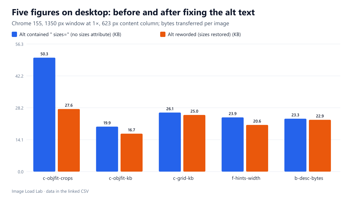
On the desktop, every affected image downloaded the full-size file. Our content column is 623 pixels wide, but without sizes Chrome sized the images for the 1350-pixel window and took the 948- and 1,200-pixel originals. With sizes restored, it took the 768-pixel versions. The five images went from 143 to 113 KB in total. The photographic crop panel alone fell from 50.3 to 27.6 KB; the charts, which compress very well, saved less.
On the phone, nothing changed. There, the content column is almost as wide as the screen, so the browser’s 100vw assumption happened to be about right, and the same 768-pixel files were chosen before and after.
Who is affected
- Sites that write about HTML or images. Alt text and captions that quote markup are the most likely to contain ” sizes=”. The same search also sees other attributes in the tag, such as
titleordata-attributes. - A related check for
srcset. In the same source code,wp_filter_content_tags()skips an image entirely when its tag contains ” srcset=”. An alt text quoting ” srcset=” would therefore leave the image with neither attribute. We read this in the code but did not test it on this site. - Not affected: alt text that mentions “sizes” without the equals sign right after it, or without a space before it.
How to check and fix it
- View the source of a post with several images and search for
srcset=. Every match should have asizes=attribute in the same tag, outside the alt text. - To find candidates across a site, search your posts’ content for alt or title attributes containing
sizes=orsrcset=. A database search or a REST API script works; we used the latter. - Reword the alt text: “sizes set to 300px”, or put the markup in the surrounding text or caption instead. Alternative text is meant for people anyway; it rarely needs literal code.
- Republish and check the HTML again.
For the general rules of writing sizes, see our srcset and sizes guide and our grid layout test. For writing good alternative text, see our alt text audit test.
Practical conclusion
WordPress decides whether an image already has a sizes attribute by searching the whole tag for ” sizes=”, alt text included. On this site, five images whose alt text quoted that string got a srcset without sizes, and on desktop they downloaded the full-size files: 143 KB instead of 113 KB. Rewording the alt text fixed all five. If you write about responsive images, check your alt text for quoted markup.
Limitations
Five affected images on one site, two screen profiles and one browser. The savings depend on how much wider the full-size file is than the next generated size. The behaviour comes from the WordPress code we read on October 18, 2026, and may change in future versions.
Data and files
Download wp-alt-sizes-before.csv (10 rows, 1.3 KB) · Download wp-alt-sizes-after.csv (10 rows, 1.3 KB) · Method: testing methodology.