We Audited Every Image on This Site: What We Found and Fixed
All 188 image loads were WebP and close to the right size on a phone. On desktop, a stale sizes value and a WordPress quirk sent oversized files; fixing them cut the category archive from 127 to 77 KB.
We publish advice about delivering images, so we owed ourselves the same check. We loaded eight pages of this site on a phone and on a desktop screen, scrolled each one to the end, and recorded every image the browser downloaded: its format, its real pixel size, the space it filled on screen and its transfer size. Does this site deliver the image sizes it recommends, and where does it fall short? Here is what we found and what we fixed.
The audit
The pages were the home page, the guide index, a category archive, three guides with different kinds of figures, the About page and the srcset tool page. We loaded each with Chrome 155.0.8059.82 through Playwright in two configurations: a phone (412 CSS pixels wide, 1.75× density) and a desktop window (1350 pixels, 1×). Each page was scrolled to the bottom so that lazy-loaded images also loaded, and advertising requests were blocked so that only our own images were counted.
For every image from our media library, we loaded the chosen file separately to read its real width. We compared that with the displayed width multiplied by the screen density, which is the width it needs to look sharp, and read the transfer size from the browser’s resource timing. See our methodology.
Results
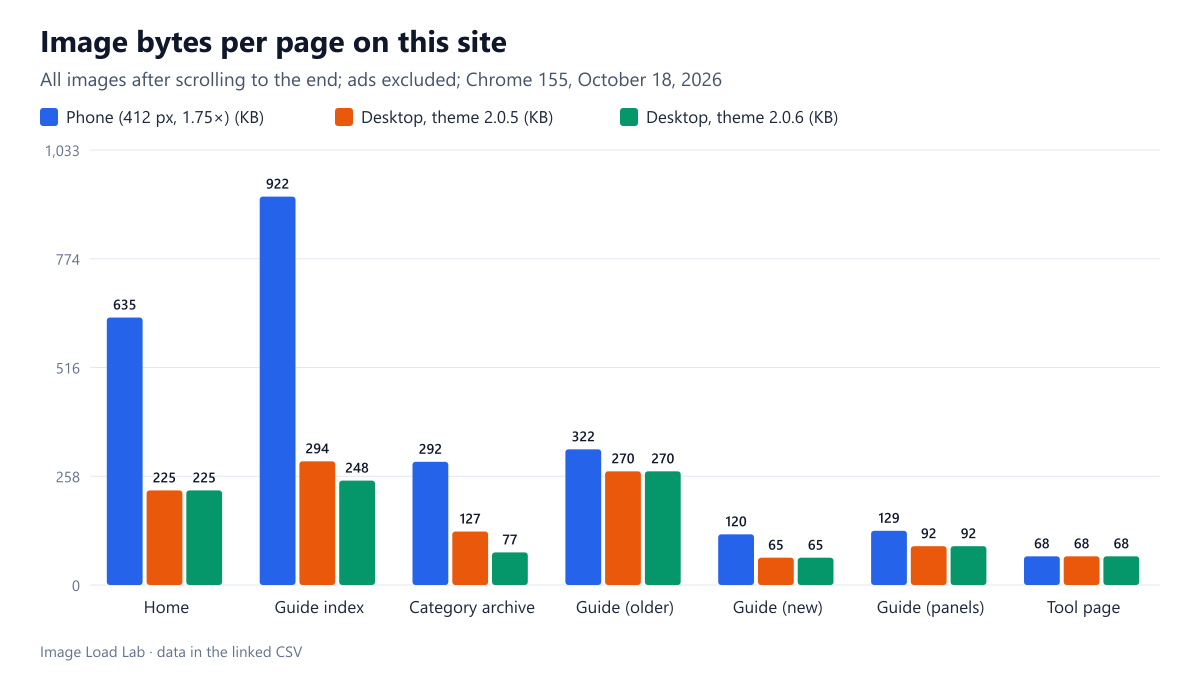
| Page | Screen | Images | Image bytes | Median file ÷ needed width | More than 1.5× too wide | Too narrow |
|---|---|---|---|---|---|---|
| Home | Phone | 27 | 635 KB | 1.19× | 0 | 0 |
| Guide index | Phone | 40 | 922 KB | 1.19× | 0 | 0 |
| Category archive | Phone | 11 | 292 KB | 1.19× | 0 | 0 |
| Guide (older) | Phone | 5 | 322 KB | 1.19× | 0 | 0 |
| Guide (new) | Phone | 5 | 120 KB | 1.19× | 0 | 0 |
| Guide (panels) | Phone | 5 | 129 KB | 1.19× | 0 | 0 |
| Tool page | Phone | 1 | 68 KB | 0.94× | 0 | 1 |
| Home | Desktop, theme 2.0.5 | 27 | 225 KB | 1.15× | 3 | 0 |
| Guide index | Desktop, theme 2.0.5 | 40 | 294 KB | 1.15× | 3 | 0 |
| Category archive | Desktop, theme 2.0.5 | 11 | 127 KB | 1.15× | 3 | 0 |
| Guide (older) | Desktop, theme 2.0.5 | 5 | 270 KB | 1.15× | 0 | 0 |
| Guide (new) | Desktop, theme 2.0.5 | 5 | 65 KB | 1.15× | 0 | 0 |
| Guide (panels) | Desktop, theme 2.0.5 | 5 | 92 KB | 1.15× | 2 | 0 |
| Tool page | Desktop, theme 2.0.5 | 1 | 68 KB | 1.00× | 0 | 0 |
| Home | Desktop, theme 2.0.6 | 27 | 225 KB | 1.15× | 3 | 0 |
| Guide index | Desktop, theme 2.0.6 | 40 | 248 KB | 1.15× | 0 | 0 |
| Category archive | Desktop, theme 2.0.6 | 11 | 77 KB | 1.15× | 0 | 0 |
| Guide (older) | Desktop, theme 2.0.6 | 5 | 270 KB | 1.15× | 0 | 0 |
| Guide (new) | Desktop, theme 2.0.6 | 5 | 65 KB | 1.15× | 0 | 0 |
| Guide (panels) | Desktop, theme 2.0.6 | 5 | 92 KB | 1.15× | 2 | 0 |
| Tool page | Desktop, theme 2.0.6 | 1 | 68 KB | 1.00× | 0 | 0 |
Every one of the 188 image loads was WebP, and on the phone every image was between 6 % narrower and 20 % wider than needed. The median file was 1.19 times the width needed, typically a 768-pixel file for a slot needing 663 pixels. One image, the screenshot on the tool page, was 6 % too narrow: 624 pixels for 663 needed.
The desktop showed two real problems. On the home page, the guide index and the category archive, three images per page were 2.2 to 2.9 times wider than needed. On one guide, two figures were 1.5 and 1.9 times too wide.
Problem 1: the first archive cards
Earlier on the same day we had stopped forcing loading="lazy" on archive cards, as described in our archive lazy-loading test. That left the first three cards eager, and eager images do not get WordPress’s sizes="auto". They fell back to our theme’s own sizes value, which told the browser that cards are 340 pixels wide on desktop. In reality they are 261 pixels wide in the four-column grid. Because WordPress offers no size between 300 and 768 pixels, 340 meant the 768-pixel file every time.
We rewrote the theme’s sizes from the grid’s real breakpoints (version 2.0.6), ending in 262px for the four-column layout. On the desktop, the guide index fell from 294 to 248 KB of images and the category archive from 127 to 77 KB, with no change on the phone.
Problem 2: two figures without sizes
Two figures on the object-fit guide had a srcset but no sizes attribute, so the browser assumed they would fill the whole window and downloaded the full-size files. The cause turned out to be a WordPress quirk triggered by their alt text, which we describe in our alt text and sizes test. Three more figures on other guides had the same problem; we reworded all five alt texts.
What we have not fixed yet
- The three featured results on the home page fill 357 pixels on desktop and download 768-pixel files (2.15× too wide). The fix is an image size between 300 and 768 pixels, as our srcset widths test recommends, but that means regenerating the sizes of every existing upload. We have not done that yet.
- The tool page screenshot is 6 % too narrow on our phone profile. The difference is invisible in practice, but a wider upload would solve it.
- The largest single image is a 239 KB panel of 100 % crops in our format comparison. Its purpose is to show fine compression detail, so we have kept it at a high quality rather than shrinking it; it is lazy-loaded and sits well below the first screen.
Audit your own site the same way
- Open a page in Chrome, open DevTools, and in the Network panel filter by “Img”. Reload and scroll to the end.
- For each large image, hover over it in the Elements panel. Chrome shows the rendered size and the intrinsic size; compare the intrinsic width with the rendered width times your screen’s density.
- Check that every
<img>with asrcsetalso has asizesattribute, and that its values match your layout. Our grid sizes test shows how to derive them. - Repeat on a phone-sized viewport. Our DevTools audit guide covers the Network panel in detail.
Practical conclusion
All images on this site were WebP and close to the right size on a phone. On the desktop, a sizes value that no longer matched the layout sent 768-pixel files to 261-pixel card slots, and a WordPress quirk removed sizes from five figures. Fixing both cut the desktop guide index from 294 to 248 KB of images and the category archive from 127 to 77 KB. A size between 300 and 768 pixels is still missing from our setup.
Limitations
Eight pages, two screen profiles and one browser, on one day. Bytes were counted after scrolling to the end of each page; visitors who do not scroll download less because of lazy loading. Advertising images were excluded.
Data and files
Download site-image-audit-theme-205.csv (188 rows, 20.6 KB) · Download site-image-audit-theme-206.csv (188 rows, 20.6 KB) · Method: testing methodology.